The OnePlus 3T Review
by Brandon Chester on November 28, 2016 10:30 AM EST- Posted in
- Smartphones
- OnePlus
- OnePlus 3T

Back in June, OnePlus launched their new flagship smartphone, the OnePlus 3. I've had an interesting relationship with the OnePlus 3 due to certain decisions that were made regarding its display and some parts of the operating system before the phone initially launched. Since that time, OnePlus has made significant improvements to both of these aspects, and in my follow up piece I concluded that the OnePlus 3 should be considered by all smartphone buyers, even ones who were ready to pay $700 or $800 for a flagship phone from another company.
Earlier this month, OnePlus surprised a number of people in the Android community by launching a successor to the OnePlus 3. This move isn't in line with the yearly cadence that we've come to expect for their smartphones, which makes it all the more interesting. The name of this new phone is the OnePlus 3T, and based on that name one can already see that it represents an evolution of the OnePlus 3 rather than a revolutionary upgrade. As the OnePlus 3's successor, the OnePlus 3T simply serves to update certain aspects of the phone's hardware in order to take advantage of technology improvements that have been made available since the OnePlus 3 was originally developed and released.
This review focuses on the aspects of the OnePlus 3T that differ from its predecessor. Because of that, I recommend reading over my review of the OnePlus 3 if you're interested in other aspects of the phone like the camera quality. Before moving on, I've collected all the specifications for the OnePlus 3 and 3T in the chart below to make it clear which parts have changed and which have remained the same.
| OnePlus 3 | OnePlus 3T | ||
| SoC | Qualcomm Snapdragon 820 2 x 2.15GHz Kryo 2 x 1.6GHz Kryo 624MHz Adreno 530 |
Qualcomm Snapdragon 821 2 x 2.35GHz Kryo 2 x 1.6GHz Kryo 653MHz Adreno 530 |
|
| RAM | 6GB LPDDR4 | ||
| Display | 5.5" 1920 x 1080 PenTile AMOLED | ||
| Size / Mass | 152.7 x 74.7 x 7.35mm, 158g | ||
| Battery | 3000 mAh | 3400 mAh | |
| Rear Camera | 16MP 1.1 μm Sony IMX298, f/2.0, OIS | ||
| Front Camera | 8MP 1.4 μm Sony IMX179, f/2.0 |
16MP 1.0 µm Samsung S5K3P8, f/2.0 |
|
| Storage | 64GB UFS 2.0 | 64/128GB UFS 2.0 | |
| I/O | USB 2.0 Type-C connector, 3.5mm audio | ||
| Connectivity | 1x1 802.11a/b/g/n/ac + BT 4.2, USB-C, GPS/GNSS | ||
| Software | Android 6.0.1 OxygenOS 3.2.8 |
Android 6.0.1 OxygenOS 3.5.1 |
|
| Price | 64GB 399 USD |
64GB 439 USD 439 EUR 399 GBP 599 CAD |
128GB 479 USD 479 EUR 439 GBP 639 CAD |
For the most part, the OnePlus 3T is the same as the OnePlus 3. The size and mass are both the same, the display is the same, the rear-camera is the same, and the connectivity is the same. Internally OnePlus has made some changes to certain components. The most obvious change is the new SoC, with Snapdragon 820 being replaced with a faster Snapdragon 821 chip, while the RAM remains a healthy 6GB of LPDDR4. The battery capacity has also increased from 3000mAh to 3400mAh, which is a 13% increase without any change in the size or mass of the phone. The last major change is the new front-facing camera, which has moved from the 8MP 1.4µm Sony sensor on the OnePlus 3 to a 16MP 1.0µm Samsung sensor. In addition to the changes across all models, OnePlus has also introduced a 128GB SKU for users who need more storage. All of these changes also come at a higher price, with the 64GB model starting at $439, up from $399, and the 128GB model coming in at $479.
Design
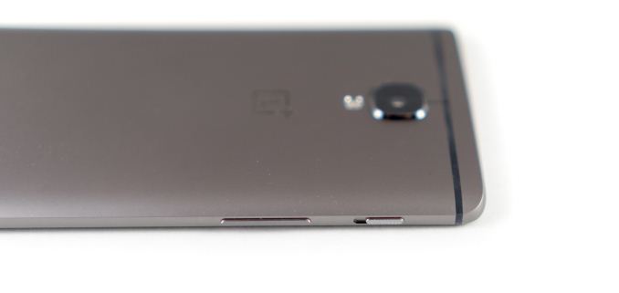
As far as its design goes, the OnePlus 3T is mostly unchanged from its predecessor. I'm quite a fan of the OnePlus 3's design, so I don't feel that there was any need to change it significantly. The relatively thin body and the tapered back design make it far more usable with one hand than other 5.5" smartphones like the Pixel XL or the Moto G4. Being made from a single piece of aluminum, the chassis has none of the seams that the OnePlus One and OnePlus 2 had, and it feels incredibly solid in the hand. Unlike certain other vendors, OnePlus has also taken the time to actually align the various ports and buttons on the sides of the chassis instead of placing them wherever is convenient without any regard for aesthetics or usability.
Beyond the purely physical aspects of the design, I think OnePlus's design decisions regarding the placement of controls also makes the phone easier to use than competing devices. Having been using the OnePlus 3 since launch, I can say with certainty that OnePlus is on the right side of history by putting the volume rocker on the left side of the phone along with a physical switch for toggling notification settings. I also really appreciate having capacitive navigation buttons instead of wasting space on the display with on-screen buttons sitting above a bottom bezel that could easily fit physical ones. Putting the fingerprint scanner on the front of the phone as part of the home button also makes it simple to turn on and unlock the phone, even if it's sitting on a table.
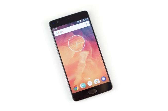
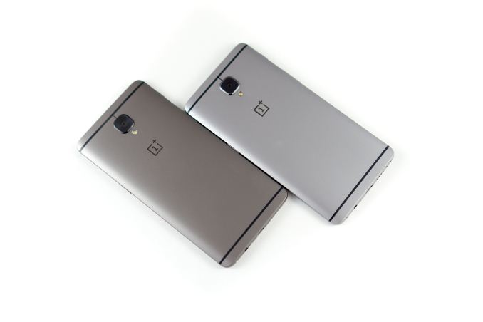
The only aspect of the design that has changed from the OnePlus 3 is the color of the phone. The OnePlus 3 was originally available in a standard silver aluminum finish and later came in a gold finish, while the OnePlus 3T comes in a gunmetal grey finish and a gold finish from the start. The gold finish is only available in a 64GB capacity, while the gunmetal has both a 64GB and a 128GB version. For this review the 128GB gunmetal model was sampled, and I think it's a nice look for the phone. It's certainly not as dark as Apple's black iPhone 7 finish, but it's visibly darker than the OnePlus 3's aluminum and helps to distinguish between the two. I wouldn't have minded if OnePlus had also kept the standard silver finish available, as I think it looked rather nice as well, but I don't think the gunmetal is such a dramatic change in color that users will be bothered by silver being unavailable.


104 Comments
View All Comments
igavus - Monday, November 28, 2016 - link
I hope that history will start putting buttons on the right side though, cause the left side is firmly inside the the wallet and thus inaccessible. One could make the wallet open up on the wrong side.. but, why?!negusp - Monday, November 28, 2016 - link
...left-handed people?greyhulk - Monday, November 28, 2016 - link
Wallet? Who the hell puts their phone in a wallet?MonkeyPaw - Monday, November 28, 2016 - link
I think the poster means those wallet cases. For people who want a bulkier phone, all while looking like they are talking into their wallets! I guess it might be more practical if one also wields a purse?jaspreet - Tuesday, November 29, 2016 - link
My office collegue got a pixel xl and has been showing off as to how good it is . I will be sending him this article which clearly shows that pixel xl is a much much poorer phone than a almost half priced One Plus 3T . Time to shut him up :)igavus - Tuesday, November 29, 2016 - link
Well, it's the least bulky option of carrying everything I need in one item. Separate wallet, card holder, phone, key chain - even more bulk. As for talking to my wallet, you get used to it :)Meteor2 - Tuesday, November 29, 2016 - link
I've had several different magstripe cards -- hotel key cards, shop loyalty cards, a credit card -- wiped, presumably by EM radiation from the phone, in wallet cases. Lesson learnt! I do use a wallet case though as they provide all-round protection without ruining the display with a screen protector.skeeter1234 - Thursday, December 1, 2016 - link
Wallet cases have magnetic strips to keep the case closed.....bad for credit cards or anything close by with a mag strip....leexgx - Wednesday, January 18, 2017 - link
not a problem in the EU/UK as we use chip and pin (my mag strip mite be working mite not be I don't know nor care), but damaging the screen protector or the screen it self I have seenhappen in these type of caseslazarpandar - Tuesday, November 29, 2016 - link
Lol what wallet are you talking about you spaz